Written by the product design team: Alejandra Castro, Tere Carbajal, Jair Pérez
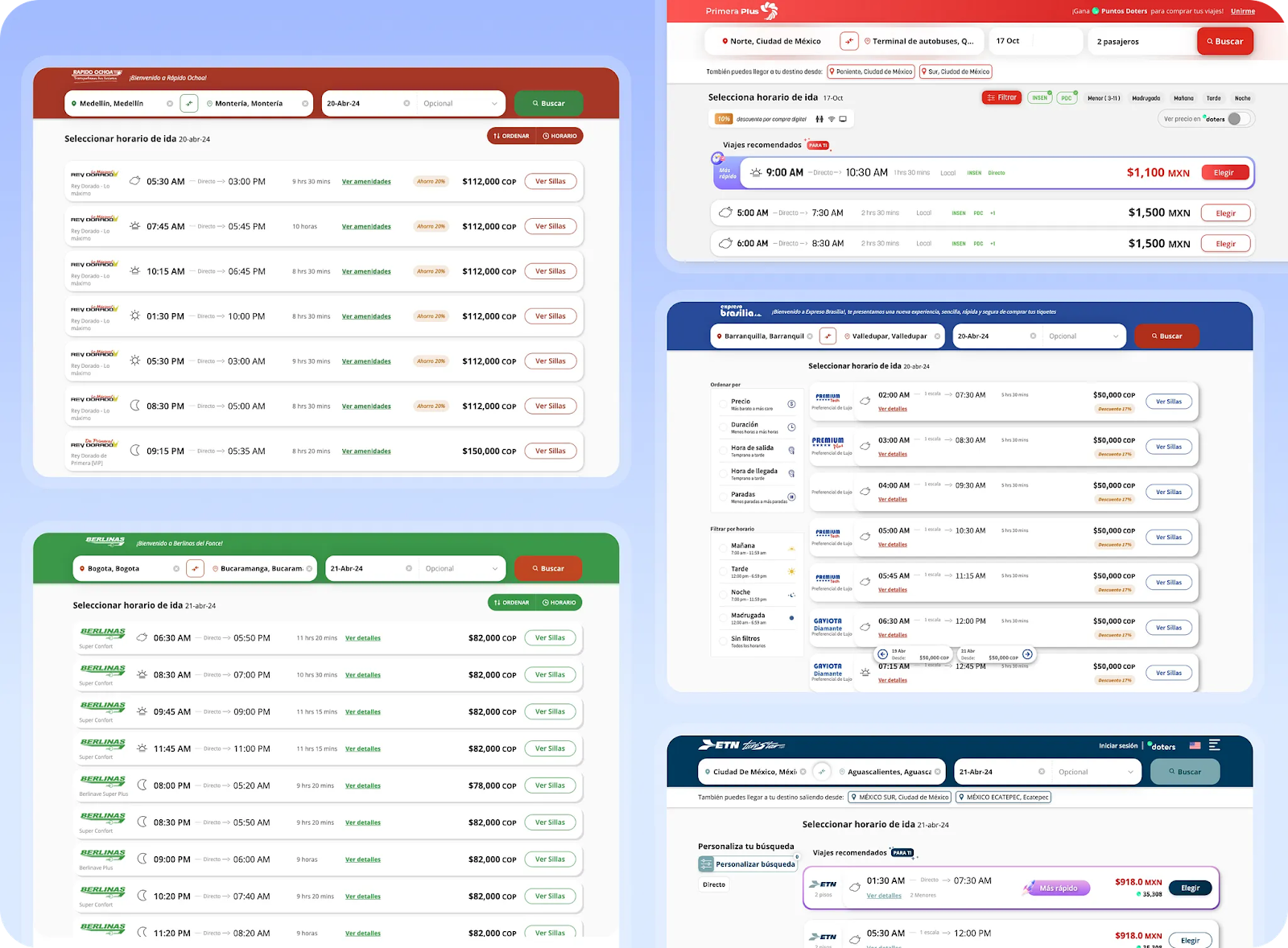
At Reserhub, technology should simplify, not complicate, especially when building ecommerce platforms for ground transportation companies that offer up to 20 departure times on a single bus route.
While visually clean, our schedule lists weren’t helping users easily identify the best option. Many departures had similar prices and durations, making it unnecessarily hard for travelers to decide.
Our objective was clear: to assist bus companies in providing users with a quick, visual method to identify the best departure, thus streamlining the booking process. We achieved this through thoughtful design, personalization, and data intelligence.
A smarter, more visual interface
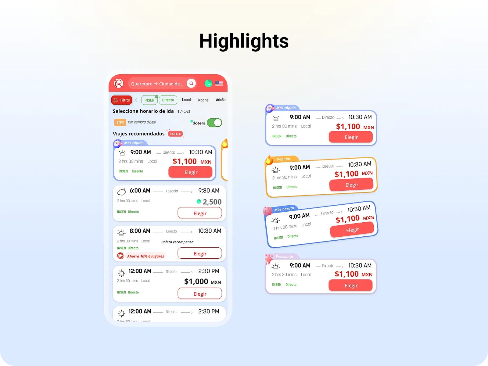
We introduced a layered interface element that adds a visual tab on each departure card. These tabs clearly and subtly highlight the key benefit of that option:
- Cheaper
- Faster
- Most popular
- Recommended for you
These indicators help users of bus companies that have implemented our technology in their direct online sales channels make more intuitive decisions, without disrupting the browsing flow.
The intelligence behind the design
Each highlighted option is driven by logic that learns from user behavior and context:
- Recommended for you: Based on past purchases, preferred times, and behavioral signals.
- Cheaper: Highlighted when there’s a clear price advantage.
- Faster: Prioritized when all prices are similar and time matters.
- Most popular: For new users, we show what others prefer.
Results that validate the vision
Since launching on our partners’ ecommerce platforms, we’ve seen major improvements in conversion rates by dynamically surfacing the most relevant departures:
- Standard (not highlighted): 12.87% conversion.
- Most popular: 13.79% (Social proof helps, but isn’t everything).
- Faster option: 17.67% (Speed matters when price is similar).
- Cheaper trip: 21.01% (Lower prices quickly catch attention).
- Personalized recommendation: 30.46% (Behavior-based suggestions drive relevance).
- Frequent itinerary: 39.12% (The clearest win: always personalize).
The more personal and contextual the suggestion, the better the results.
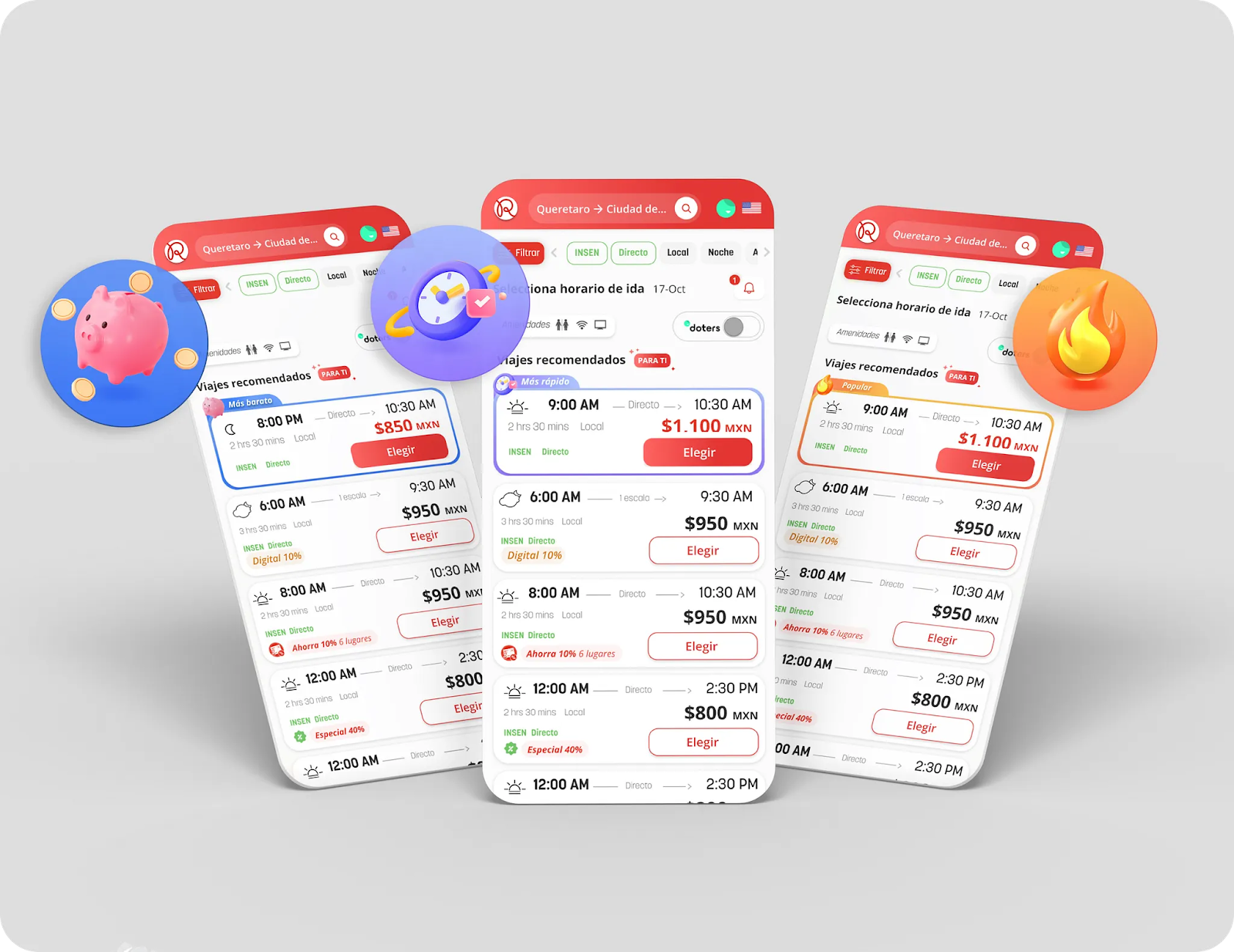
Clean design, clear Choices
The redesign also included a visual cleanup of the component, removing color overload and prioritizing essential information:
- Departure/arrival times, pricing, and the selection button are always visible.
- Contextual icons (morning, afternoon, night) for added clarity.
- Neutral colors with green highlights for active filters and discounts.
- Simplified interactions that reveal extra details without visual clutter.
A scalable backend-driven solution
From the start, we defined which categories we wanted to highlight (frequent, cheaper, faster, most popular). Then we used our data engines to dynamically populate each group with personalized results based on user behavior.
For example:
- “General recommendation”: options that meet multiple user criteria.
- “Preference itinerary”: suggestions based on preferred time of day (morning, afternoon, evening).
One key challenge was ensuring the design worked across multiple brands, each with its own identity. Striking a balance between consistency and flexibility was essential, pushing us to create a unified experience that adapts without sacrificing clarity.
This new design improves user experience, boosts conversion, reduces friction, and strengthens our partners’ direct online sales channel.
At Reserhub, every component we design serves a strategic purpose: helping companies deliver more personalized, seamless digital experiences to users while increasing profitability for every partner brand.